SGCI 2018 - Las Vegas

So.... to be honest I was a little iffy about this trip to Vegas before we left. I'm not talking about the 21 hour drive there and back (plus a detour to the Grand Canyon, which was totally worth it), but really about the whole SGCI conference in general.  The whole point of this conference is to be an convergence of printmakers, sharing ideas, techniques, and creating new connections with other printers across the globe. It still does all of these things, but with a bit of a cost.

I know I sound extremely negative in the beginning of this post, and I didn't really intend for it to sound this way, but I'm being honest about my initial thoughts. So I'll go through some aspects of the conference and kinda show the pros and cons of the whole situation.

First is the whole idea of Vegas.  Who thought it was a good idea to have a conference in Vegas? Or that it was a good idea to take a bunch of undergrads to Vegas (I'm glad I didn't lose any of them!). One of the biggest issues I have with the conference is how expensive it is becoming, not just with conference fees, but paying for hotel and travel. Because the Vegas strip ain't cheap.  The purpose is to bring these printers, educators, artists, and students together, but end up excluding a large majority of these people (especially students) because they can't afford the costs of the trip.  I know that without grant and fund raised money, we would not have been able to go.

Enough of my nagging and I will get to the cool stuff:

DEMOS/PANELS/VENDORS

This is basically the meat and potatoes of the conference. 

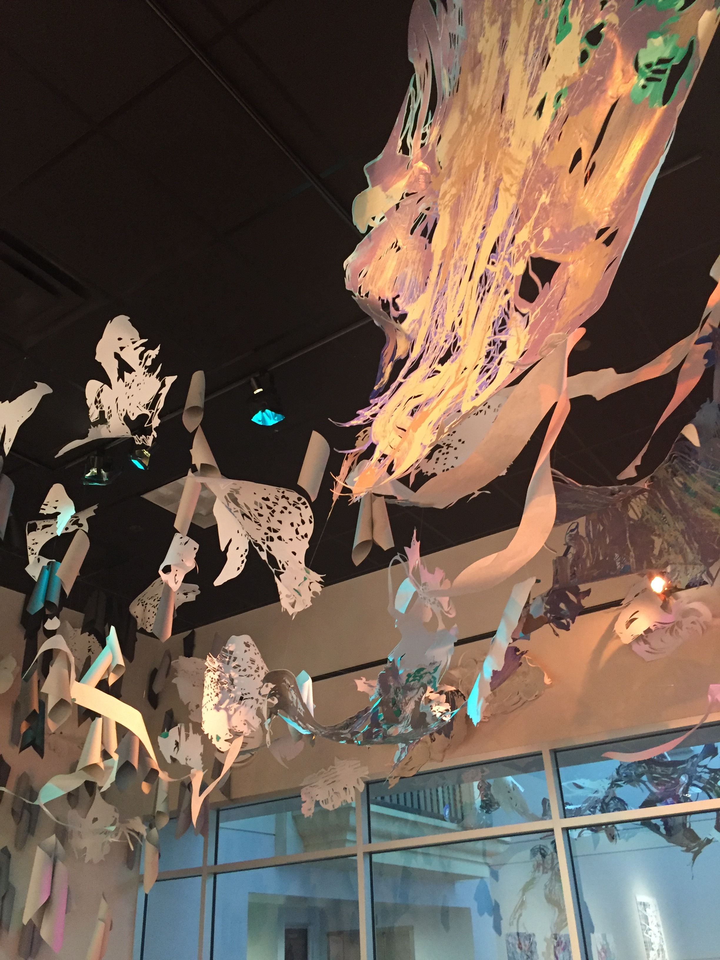
The vendor fair is always really cool, because its seems that everyone always comes together here just to socialize. And you get discounted or free loot!

IMAGE.JPG

While with some of the demonstrations and panels of the conference are been done before, its always interesting to see and learn.  Mostly because printers are always looking to see how other people do things.  Because sometimes you learn something new or just learn a new trick from someone else (or solidify that you are doing something a better way).

I went to visit three of the demonstrations. The first being a comparison of metal and wood engraving. While I'm not an engraver it is a type of art that I appreciate (and in awe of) very much. It was interesting to learn the differences of the two techniques and the histories behind them.

IMAGE.JPG

I also attended a demo of electro-etching, while this is not a new technique and is mostly used for commercial purposes, it was interesting to see. I had never seen this done before, and especially would not have considered it in a studio setting. Is it something I would do? No it is not, even if I did etching on the regular.  Printers are always looking for ways to become more eco-friendly (which I'm totally for, even if I'm very much set in my ways).  Conducting this process works to eliminate the need for corrosives, which is cool, but doesn't really work in the art making process. By becoming more eco-friendly, you end up losing the quality of mark making that makes etchings so beautiful.

IMAGE.JPG

The last demo I actually wasn't planning on going to see, but Hannah was interested in it so I decided to go give it a look see.  What the artists was doing was printing collographs into clay tiles and firing them. While this doesn't seem so special, it was not something that I would have thought about.  What was nice about this demo was not just the simplicity of it but it went though what could go wrong with the process and trouble shot any issues one may have from doing this technique.

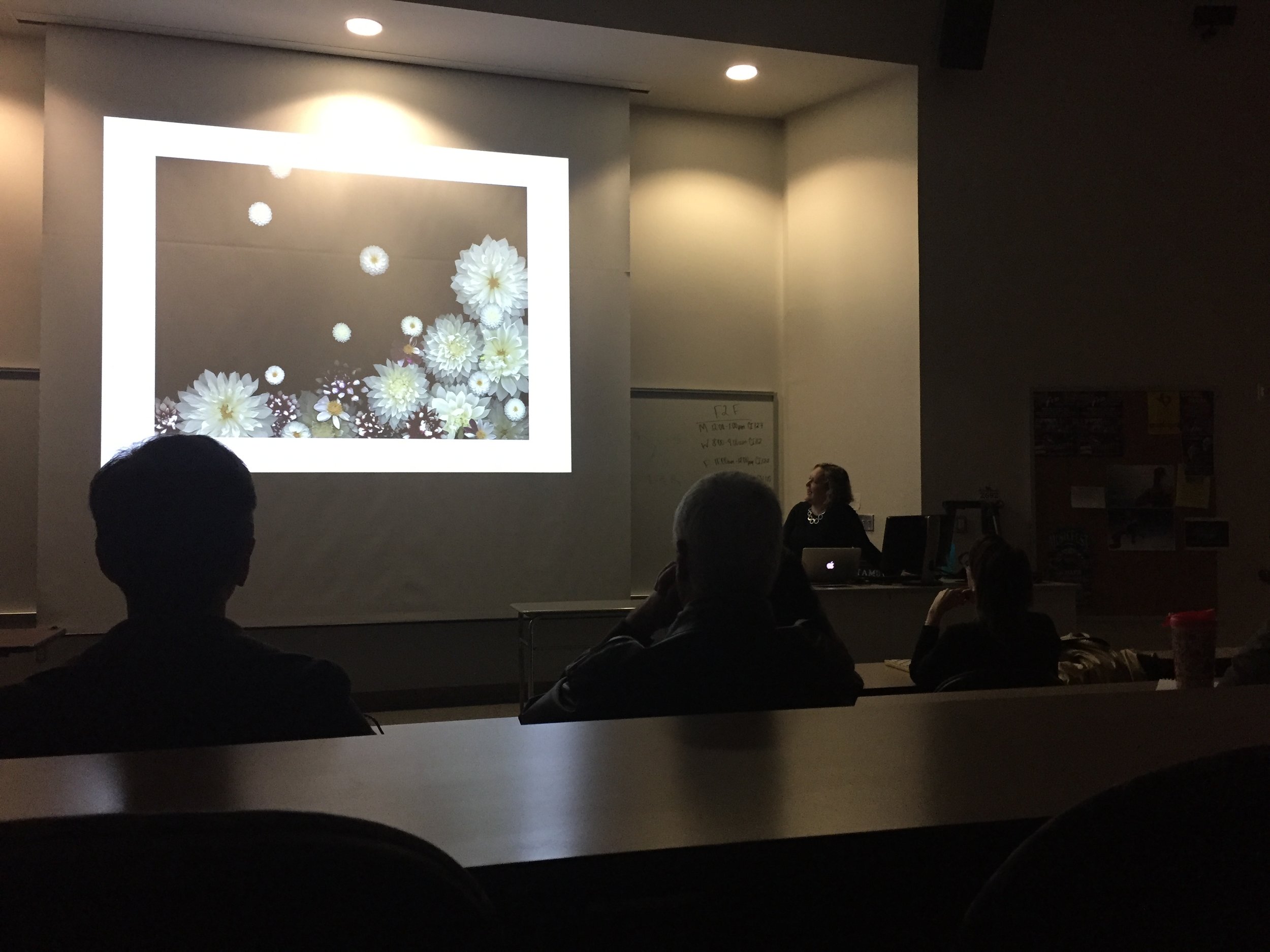
What I really enjoy are the panels. While most people find these to be bland, I actually find them to be really informative. I've always have found myself to be interested in people's stories, and that exactly what we get out of these panels. The first I attend was about women being community leaders in print (as shown in the picture).  The four women in the panel all come from different backgrounds and are leaders in four different types of print foundations, from a print shop, a non-profit foundation, a foundation for profit, and a community service center geared towards veterans. It was interesting to here their successes and their woes.  One thing they all had in common was the need to stay financially alive. Which is a sad truth in their world.  There is always a constant struggle to fight to stay alive.  What I found touching was one of their shared successes and that is the success of the artists and prints that go to work with them.  I believe this to be the same in academics as well.  

IMAGE.JPG

One of the most important things I got out of this panel came as an answer to a student's question.  The student had asked the panelists (who are all white), what they were doing to help women of color and those in the LGBQT+ communities. They help the at risk communities of their cities and work with trans and artists of color to further their artistic journey. They talked about working towards their needs, these women saw the lack of print shops in their own towns, the need for residencies that help artists who are also mothers, and the need to further educate, and have women as leaders in the boys club that is printmaking.  AND THEY MADE IT HAPPEN.  The majority of that room was white, so they stated that if we see that POC, especially women are not being represented, well then we have to change that.

TRADE PORTFOLIOS/OPEN PORTFOLIO SESSIONS

FullSizeRender.jpg

This is the fun part of SGCI. You could not go to any other part of the conference and just this and still feel that you got something out of it (which some people did). This is where the networking really happens, and you get to check out what other people are doing and share techniques and ideas.

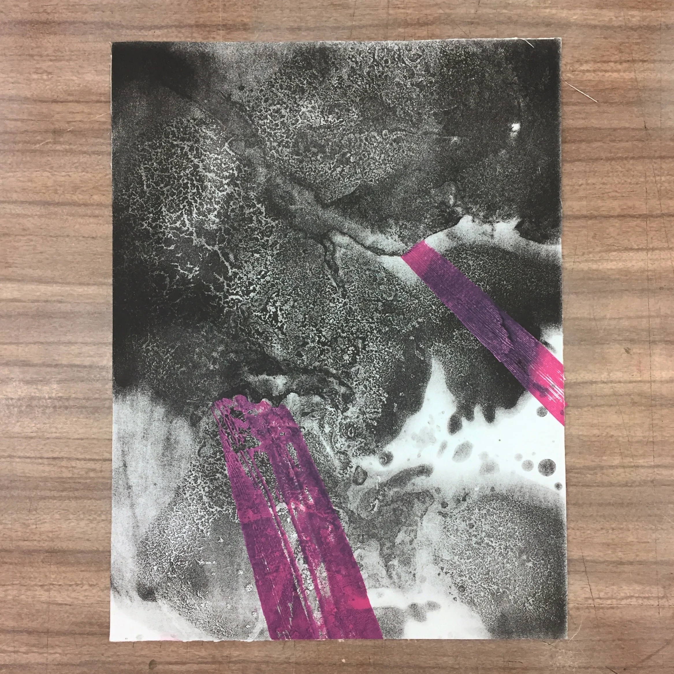
What as nice for me to see what that other people are also working abstractly, something that you don't see very much in print.  It has a tendency (and history) of being very graphic. But I've come to notice that techniques and art styles seem to come in waves, and that is okay.  Or maybe it just has to do with who is teaching you. I'm still kind of thinking of the answer behind that.

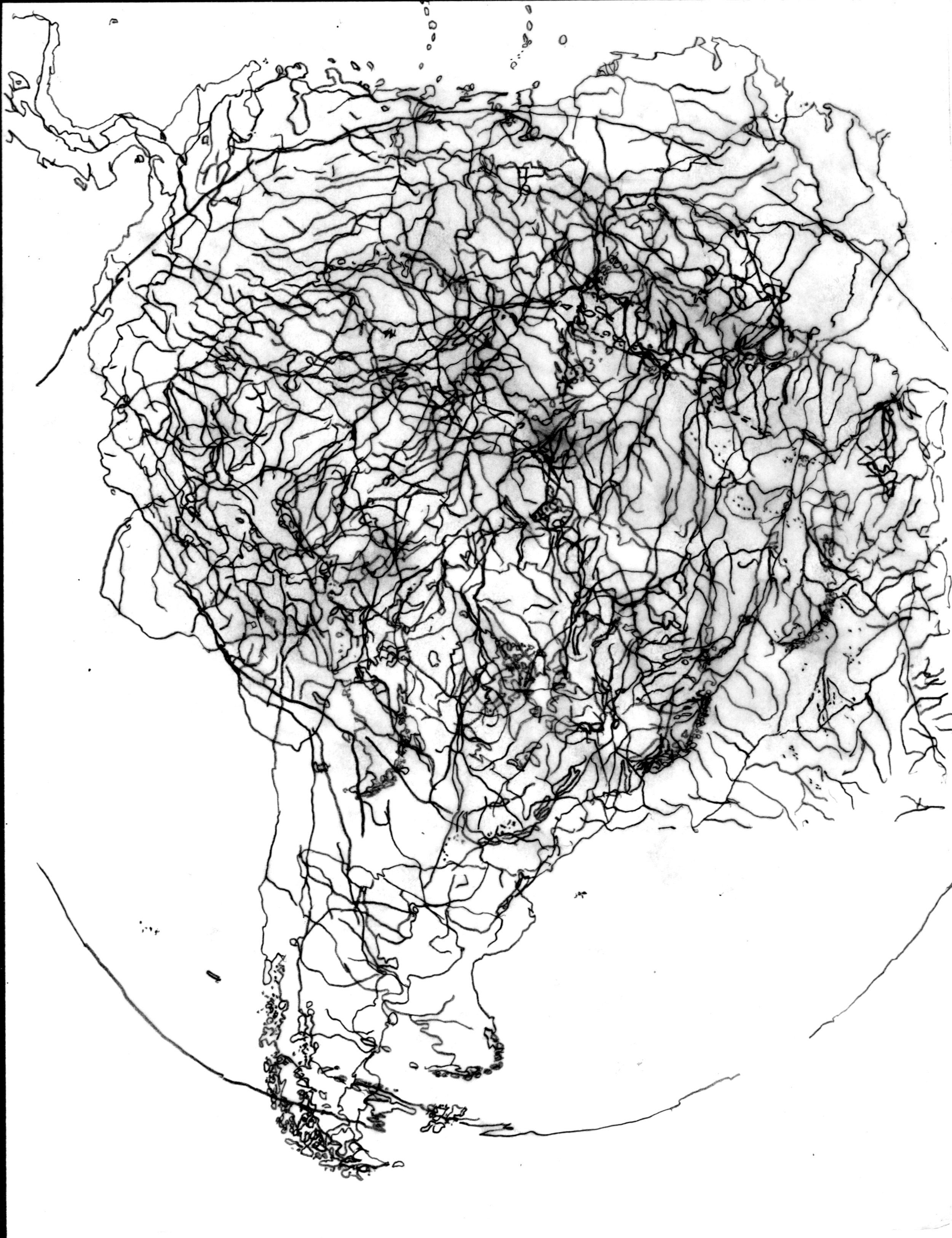
But back to abstraction, I was able to get new ideas and see different styles. It made me consider how to handle my own work.  I spent a lot of time speaking with Mark Bovey who is an associate professor at NSCAD University in Nova Scotia. He primarily works in washes and acrylic reversals in conjunction with charts and graphs. It was interesting to look at his work and see a way how to marry my love of washes with the map work I'm currently making.  Will I do it the same way he is doing it? No most definitely not, but its something to think about.  Above is the work by Kelsey Stephenson, from Alberta. I fell in love with her work. Maybe because at one point I wanted to make work like this, but at a much larger scale.  It was really nice talking to her and hearing about her process and her ideas in art making.

IMG_8615.JPG

What is most important about this is the networking.  While my primary goal was to recruit new grads, and I did talk to a lot of really talented artists looking into graduate school (not just in print either!). But it is also important for everyone else to make connections as well.  Which is one of the reason I'm really thankful for Ryan and Rich, because at any point I was walking around with them they would introduce me to all sorts of different people. And I tried to do the same for the undergrads that came with me.  Pictured is Allie with my friend Liz. Liz is the intern for the shop I used to work at in Austin. They became fast friends while hanging out in the casino, but she is well connected with the print shops in Austin and has printed for some big name printers. I also made a connection with some former graduates of TAMUCC, especially with Steph Alaniz, who is a grad at WVU. I have been told by many that I needed to meet here, and when we finally did, we just clicked.

All in all, even with my initial qualms it was really good and productive trip. Leaving me inspired and ready to finish my first year of grad school and maybe start some new projects.

New Drawing

So here is something new. I’ve been making layered map drawings. This is the first one that is large (I think it’s about 5 feet long) and blue. I’m not quite sure where these are heading yet but I’ll probably try screen printing them later this week. 

FullSizeRender.jpg

A little bit about this image... It’s five different world maps on top of each other. All from different perspectives. One is the typical world map, EurAsia centered, Americas centered, Pacific Ocean centered and upside down. Depending where you are in the world the map maybe centered on a different continent. Upon this research I learned about the purpose of upside down maps. The connotation of the northern hemisphere being richer or “better” effects peoples view of the souther hemisphere. Supposedly the upside down map is supposed to aliviate some of these negative feelings. I’m not really sure about that but it’s cool to know. 

Anyway... I came up with this idea due to the fact that depending on where you are in the world you get a different perspectives of places not your own. Whether they be “exotic”, “shithole”, first world or third world it doesn’t really matter because on paper it’s all the same.

*Chuck Close

29Close-1-master768-v3.jpg

I'm writing in response to the New York Times and Huffington Post articles concern the response of sexual harassment accusations directed towards Chuck Close.

Back in December, HuffPost posted an article stating the sexual harassment accusations against Chuck Close. Since then eight women have spoken up stating that Close told them to get naked during modelling sessions. 

Since then the exhibit of Close's work at the National Portrait Gallery set to open in April has been indefinitely postponed.  His current exhibit at the Pennsylvania Academy of Fine Arts has not been taken down, but after the deliberation of the Academy, they have opened an adjacent exhibit concern issues of sexual harassment. 

merlin_132990683_318d119d-167b-4104-b7be-227f6abc7815-master675.jpg

The New York Times posed the question of whether an asterisk should be put next to Chuck Close's name when presenting this work.  The article compared it to the asterisk placed next to Floyd Mayweather, Jr's portrait hanging in the National Portrait Gallery. Which states his domestic violence charges on the description card.  The article continues on saying that this is typical when describing the subject matter of an art piece but not necessarily for the artist.

This is beyond just putting an asterisk next to Chuck Close's name.  For centuries artists, such as Picasso and Schiele (both whom are well known for mistreating women) have shown in museums and institutions for a very long time without asterisks next to their names. Do museums and art institutions have the right to state what is right and what is wrong with culture? To put their opinions on the description card? While yes it is easy as a society to say that being a sexual harasser is wrong (and that SHOULD NOT change), I think of Adolf Hitler's Degenerate Art Show, and the xenophobia currently felt by too many Americans. That makes me think, that maybe institutions should not state their opinion on works or artists. 

Many curators also feel that they shouldn't put asterisks on the works. However others feel differently. Performance artist, Emma Sulkowicz (who uses the gender-neutral pronoun, they) is one of these people. Sulkowicz is known for carrying their dormitory mattress across campus until their accused rapist was expelled from Columbia University. They both graduated together in 2015. On January 30th, Sulkowicz silently protested in front of Close's work in New York but standing, in black underwear, high heels, asterisks over their nipples, and asterisks drawn on their body.  The asterisks are in direct response to the New York Times article from a few days before.

SANGSUK SYLVIA KANGPerformance artist Emma Sulkowicz protests Chuck Close’s artwork in the 86th Street subway station in New York by providing their own asterisks on Jan. 30. Huffington Post

SANGSUK SYLVIA KANG

Performance artist Emma Sulkowicz protests Chuck Close’s artwork in the 86th Street subway station in New York by providing their own asterisks on Jan. 30. Huffington Post

Sculkowicz speaks on the behalf of the survivors and against the masculinity of the museum space.

Either way, Chuck Close is just the beginning. The #MeToo movement has a potential effect on the museum scene, and I'm interested to see what is too come.

ESCAPE FROM PRESSURE ISLAND!

I must write about the closing party for Print Austin, Escape from Pressure Island! This has become a yearly show that Ryan puts on exhibiting print works from students, faculty, and alumni of TAMUCC.  I must say that the show came out really well!

I do have to take a moment and thank Ryan for this one.  None of this would have been possible without him.  He spent all week framing and preparing works to be hung the day before the show.

Ryan and I went to hang the show on Friday. It was important to Ryan to make this show look professional and to be at a higher caliber.  I took the  hanging as a lesson in curation. Some difficult decisions (that I'm not going to mention) had to be made, and sometimes you have to do what is right even if it is not necessarily the nicest decision.  Either way our hard work paid off.

IMG_7576.JPG
IMG_7578.JPG
IMG_7580.JPG
IMG_7584.JPG

Off the Wall

IMG_7573.JPG

During this past weekend I had the pleasure of visiting the exhibition, Off the Wall: Contemporary Prints at Southwestern University in Georgetown, Texas.  In correlation with PrintAustin, Southwestern works to bring forth a higher caliber of art works to the Austin area.  They are teaching their students the importance of working cross-mediums.

Off the Wall, presents artists with both national and international reputations that expand on the printed medium.  These artists are experimenting with the cross hairs of the 2D picture plane and the three-dimensional sculptural space.

I had first seen Nicole Pietrantoni's work during Print Houston a few years back, where I had seen the waterfall piece (that is also in this exhibition). I remember how beautiful and unique it was. I instantly remembered it when I saw it again.

Do you ever believe in destiny? Because I'm starting to think that maybe it was destiny for me to see her work again. Because Pietrantoni is probably becoming one of the most influential artists to me that I've discovered (or rediscovered) this year. Upon doing some more research on her I fell even more in love with her work. But also learned that both of us are wishing to explore the relationship between humans and nature. We both work upon interest in traditional landscape (in her case landscape photography), and the tensions between the beauty of the imagery of nature and threat of environmental change.

IMG_7572.JPG
IMG_7569.JPG

Sam Parker Salazar is an printmaker/paper sculptor out of Illinois (but received her MFA from the University of Texas at Austin when I was there). What starts as a simple monotype became artworks that transform the spaces that they are in.  Through her colorful, hand-cut paper shapes and lines, the space is transformed by the light and shadows casted by the forms. 

Parker Salazar hopes to break the typical uses of printmaking by creating installations that are unique of itself and for the space.  She is concerned with creating movement throughout the space as if it were a gestural drawing.

IMG_7568.JPG
IMG_7567.JPG
IMG_7570.JPG

Stacey Elko (who I had the pleasure of meeting and is quite a character) explorers what she calls "internal states of transformation" through her metaphorically charged Fish Bomb Boats.  These structures that hang like airships from the ceiling are very much inspired by Elko being in Morocco during her time with the Peace Corp.  Elko explained that she first created these airships for another show concerned with mobility and transportation; where she wished to create something out of the ordinary.  Thus came the creation of these airboats.  She envisioned a world drowned due to global warming and that the remnants of humanity had to live in these airboats in order to survive.  With small wooden dowels and reeds used in paper making the boats were constructed.  She then embellished them with tiny woodcuts and henna paintings, all of which were inspired by her time with the women of Morocco. 

Sang-Mi Yoo is a classically trained Korean-American artist whom constructs large hanging images of row houses and flora to explore the relationship between her experiences of living in Korea and in the United States (most recently in Lubbock, Texas).  Yoo calls to question of how domestic experiences affect perceptions of Korean and American identities.  Yoo explained the importance of being able to branch away from the work that an artist typically does.  As a classically trained lithographer, Yoo says she feels that she does tire of working on the stone, and when she creates her large paper installations it acts as a breath of fresh air.  That even when she returns to drawing and lithography after working on these large projects, it brings excitement and new light to working on those works.

IMG_7571.JPG

Print Expo 2018

IMG_7558.JPG

This week was the last weekend of Print Austin.  Every year it finishes up with a print exposition.  Since the first time I attend Print Austin in 2014, I have never had the opportunity to attend the Print Expo until this year.  While I have attended other open artist table sessions at conferences in the past, this one had a different sort of air to it.

While some artists use this as an opportunity to hopefully sell work, that is not really what this event is for.  Its more of an opportunity to talk to other print makers or to socialize with friends from other cities. There is a very relaxed sort of air to everything. What I am happy with is that the event coordinators and other artists are very good about publicizing the  event.  It brings a group of people in that may not have necessarily seen this sort of work before. 

IMG_7559.JPG
IMG_7560.JPG

Reading Assignment 2: Tue Greenport

Tue Greenport does not consider himself and Eco artist.  However is more interested in putting humanity in the forefront of their relationship with the environment.  His work evolves around ecology, its history, the environment, social relations, and human subjectivity. Greenport does this by interweaving the subjects of public and private realms, nature, and culture.

tumblr_n20gccjFG81rj6hkro4_1280.jpg

During his situational installation, Still Life: Art, Ecology and the Politics of Change, Greenport created a situation where the gallery (in the United Arab Emirates) raised the temperature of their air conditioning up by 2 degrees Celsius. The exhibition space only had what was needed in it.  A machine that marks the changes in temperature and humidity in the space and the table it sits on. Along the air vents there are pieces of material showing when the air changes in the room. On the walls, there is information demonstrating the importance of 2 degrees.

tumblr_n20gccjFG81rj6hkro1_1280.jpg

So why 2 degrees Celsius? According to studies on climate change, there only needs to be a two degree difference on Earth to cause catastrophic change in the world's environment. There was a struggle to convince the museum to allow the temperature change by two degrees.  There was an argument with the museum curators, due to the concern of the antiquities and art works in the permanent collections not being able to withstand the temperature difference.  However the sheikh whom owns the majority of the collections, said to continue with the exhibition.  

The real purpose of this exhibtion was to show what can be done with resources if we were to continue to conserve energy like this.  The money that was saved from raising the temperature was used to buy a piece of land in the rain forests of Ecuador. Thus protects the land from any future development, deforestation, or pollution.

Reading Assignment 2: Bright Ugochukwe Eke

Bright Ugochukwe Eke is an eco artist from Nigeria.

Nigeria is a country in Western Africa, where petroleum is a major industry.  This seemingly unchecked industry causes a lot of pollution issues in the ground, atmosphere, and water supply of the area.  After contracting a skin infection from acid rain, Eke was inspired to create work about the issue at hand. 

15.eke works 2 009, 2005-2006, shield detail.jpg

Eke is concerned about the relationship between humanity and the Earth.  He however blames modernism and the globalization of the market place.  No longer are humans connected to the Earth; but are more interested in instant gratification, with no consideration of the price it holds.  Part of the issue is that there is no education or care about the environment.  Due to the petroleum industry, there is no natural sources of clean drinking water available.  Thus drinking water is available for sale in water sachets. These cheaply made plastic packaging ultimately ends up thrown on the ground after its use. Thus creating an endless cycle of pollution.

9.Bright eke , shield 2005-2006, water sarchet.jpg

Starting in 2006, Eke started creating works out of these discarded water sachets. Initially he was filling them with acid rain and hanging them, making them into poisonous raindrops.  In 2008, he created an installation called Shields.  Eke wished to create something that gives protection from the rain. This creating objects emulating rain coats and umbrellas, but completely made out of water sachets. 

23.2_Eke.jpg

Eke has a concern with the community and the land.  When the work was shown in Lagos, he had a group of locals wear the coats and use the umbrellas around town. This is all in the hopes of being an education to the community about the environment and living greener.

These "shields" act as a barrier of protection.  This interest of a barrier or boundary continues into Eke's later works.  Thematically Eke is speaking on the politics of water. As clean water becomes more precious, different locales or boundaries take either higher or even lower considerations on the cleanliness of our drinking water. 


WASHMENOW

Here is a new wash I printed from last night.  I'm really happy with how this one came out. It was a real struggle last semester with a lot of my washes filling in. This semester I'm planning on incorporating these with the relief/collagraph layers I create with found objects that have washed up along the bay.

FullSizeRender.jpg

Something New

Here are some drawings I've been working on for the past couple of days. I'm not quite sure what I will make these into prints or larger scale drawings yet. They were built by overlaying different map images on top of each other. These are all countries/continents that I have lived in, only documented by ocean borders and rivers. 

Italy.jpg
America.jpg
S America.jpg

Reading Assignment 1

Prior to class: Read To Life p 43-50 - Eco Art Materials Make a list of 10 materials that you had not considered art materials. Select 2 from this list and design a sculpture using that material as primary - other materials could be used for connecting or structuring. Sketch and write about these two sculptures. Come to class ready to participate where you will be sharing your theoretical sculpture. 

In class we started the discussion by observing the sculptures used for Landing on the Island, and the importance of being able to reuse as much as possible.  However this is only one of the issues artists should consider when choosing a material.  Our materials are not only considered for aesthetic value but the meaning behind them.  The class was asked to consider materials that we have not considered in the past. Here is my list:

Materials Not Considered:

  1. Slime
  2. Water/Oil
  3. Cornstarch and Water
  4. Maps
  5. Dried acrylic paint
  6. Sand/shells/pebbles
  7. Terrariums
  8. Paper pulp
  9. Plexiglass
  10. Windowscreens/mesh

For the class it was generally hard for us to come up with individual lists.  Contemporarily, art making is crossing mediums and no longer is art limited to traditional art mediums. Thus making anything and everything available to become art. 

We considered the footprints of the materials we used.  When considering a materials footprint, people consider the resources used, consumed, and waste generated.  In the process of making Eco Art it is easy to consider a material's footprint as a theme or meaning of the work.  The class was then asked to design a sculpture using non-manufactured materials.  While we did come up with projects as a group, they were not necessarily environmentally friendly or Eco Art.

When I started class on Tuesday, I wasn't really sure what I was going to be doing for sculpture class this semester.  I was (and still am) interested the social aspects behind the crisis of our drinking water (it's not safe to drink from the faucets, the gulf is dirty, etc.). However I was also considering making my own paper, out of my paper scraps or locally sourced cotton.  Which is why I listed paper pulp as one of my materials I had never considered.  It was only after I did some research that I realized paper pulp is a pretty viable sculpture medium.  So i had designed a paper sculpture for class.

I was still considering the concept of water and waves, but was trying to bring it into a installation, either by draping paper while it was in its drying stages or the recycling the iridescent mesh I had used last semester.  But I wasn't sold on the idea, and didn't mention it to anybody.

IMG_7311.JPG

The next day I had a short conversation with Ryan, having already told him about my budding interest with water issues, he recommend collecting the wood that had washed up on the bay and printing those along with my washes. We talked about the incorporation of man made and natural materials. Which got me thinking about everything else that is laying about around the beach.  I then had the idea to create 100 small sculptures (and corresponding prints) of items found on the beach, either trash, wood, seaweed, rocks, sand, plants, shells, you name it.  So yesterday I made a quick trip to Whitecap beach and collected whatever I could find whatever I could carry in my bag. This is some of what I found:

IMG_7307.JPG
IMG_7309.JPG

I'm pretty excited with what I found. The next step is to figure out how to print some of these objects.  Then comes the building of the sculptures.  I want to keep them small, something that can fit in your hand.  It almost reminds me of the things you can find at the beach gift shops. I may even consider displaying them in a similar matter.

PRINTAUSTIN: SOLAR // MISREMEMBRANCE

So a little bit about PrintAustin from the people at PrintAustin (because they are way better at words than I am):

PrintAustin's mission to the Austin art community and galleries is to share our enthusiasm for printmaking by helping galleries curate, exhibit, and promote works on paper and to engage a wider audience through in-house artist talks, signings, panels, printmaking demonstrations, and print-focused art happenings. PrintAustin

And this is exactly what PrintAustin does.  It started a few years ago as a small group of galleries and print shops in Austin hosting different exhibitions, demonstrations, and a juried show. Now the event has now grown to an international juried exhibition, multiple galleries showing arts on paper, demonstrations, panels, and artist-talks, all promoting prints.  I feel that the month long event has grown for the good. Not only has brought in a larger audience for print related arts but it also makes it easier for emerging and all ready established print-based artists to show, share information, and generally come together.

My print, Solis, was also chosen for all the promotional work for the show!

My print, Solis, was also chosen for all the promotional work for the show!

Which made me pretty excited when my piece was chosen to be apart of a group exhibition at the Art.Science.Gallery

So a little bit about the Art.Science.Gallery: its a space that shows artwork steeped in and reflective of scientific ideas. They strive to show work that integrate scientific knowledge discovery through artistic processes.

The premise for SOLAR was prints that were either about, made by or for the sun. Which immediately made me think about my print, Solis.

Solis comes from an ongoing body of work, The New Frontier, that I started in 2015. I'm inspired by the scientific endeavors to fully comprehend the different planets, stars, moons, and other entities in our universe. Solis (in reference to the sun), is part of this body of work, that is my interpretation of a full reconnaissance of our solar system (I'm still on Jupiter's moons, there is 69 of them). Current space missions such as New Horizons, Mars Curiosity, and Juno bring forth a plethora of imagery and information from space.  Some of these missions' concerns are the surface properties and atmospheres of the outer reaches of space. Solis speaks on the intensity, radiation, and brightness of the sun's photosphere and while the science behind the new discoveries may not be apparent in my work there is an integration of landscape, cartography, and the impression of looking through a micro or telescope in the prints.

But that is enough about me.....

The other great opening of the weekend was TAMUCC own Silas Braux's solo exhibition, Misremembrance at Slugfest Printmaking Workshop and Gallery. Slugfest holds a place dear to my heart (mostly because I printed there for close to four years). While you may go there for the awesome art or the cooperative workshop, you stay for the company, crazy bathroom, cats, and wine. 

Silas was chosen by Tom Druecker and Margaret Simpson of Slugfest from the Full Court Press Juried Exhibition last fall.  His work comes from his observations of the relationship between natural and built environments.  It is a stunning show of 2D and 3D works, and Silas' hard work has paid off!

breauxforcathy1509678186-870x600.jpg

All in all it was a great art filled weekend! I'll be back in Austin for ESCAPE FOR PRESSURE ISLAND on February 10th! All the work featured are from artists from the printmaking department at TAMUCC.

Getting Started

To me the first post is always the hardest. It reminds me of when I was ten years old and I would buy one of those diaries with the tiny lock from the book fair. It would be cutely (is that a word?) designed with flowers or stars or glitter and would come with a pack of stickers or a glitter gel pen. My favorite thing would be the empty pages ready to be written or drawn on. I remember flipping through the lightly dyed purple or pink lined pages, excited to fill the book. But then this ten year old's anxiety would settle in (really how anxious can a ten year old be). I didn't know what to start with;   I couldn't handle ruining what I thought was the best object I ever bought with my allowance.

This might be why I don't like keeping a sketchbook.

Anyway, I eventually get over myself, and start drawing, writing stories, taking notes on the everyday. Which is what this blog is for.

Now that I have bored whoever might be reading this with my trip down memory lane. I'm actually really excited (and maybe a little nervous) about this semester. While this first year of grad school has been about making work and experimentation, I'm wanting to be more conscious about what I'm thinking about; whether it be the universe, dark energy, water, the Earth, topography. I'm in search of way to bring these obsessions together. Let see what comes!